Farmer Market Branding
ALDERNEY
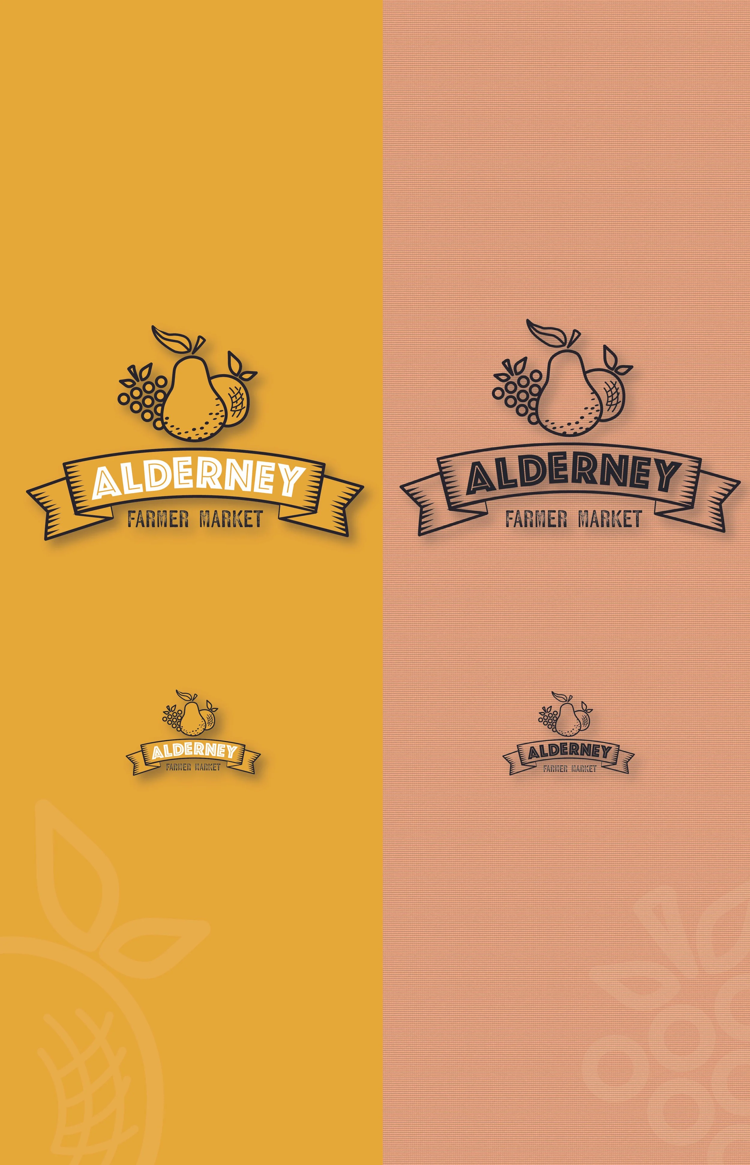
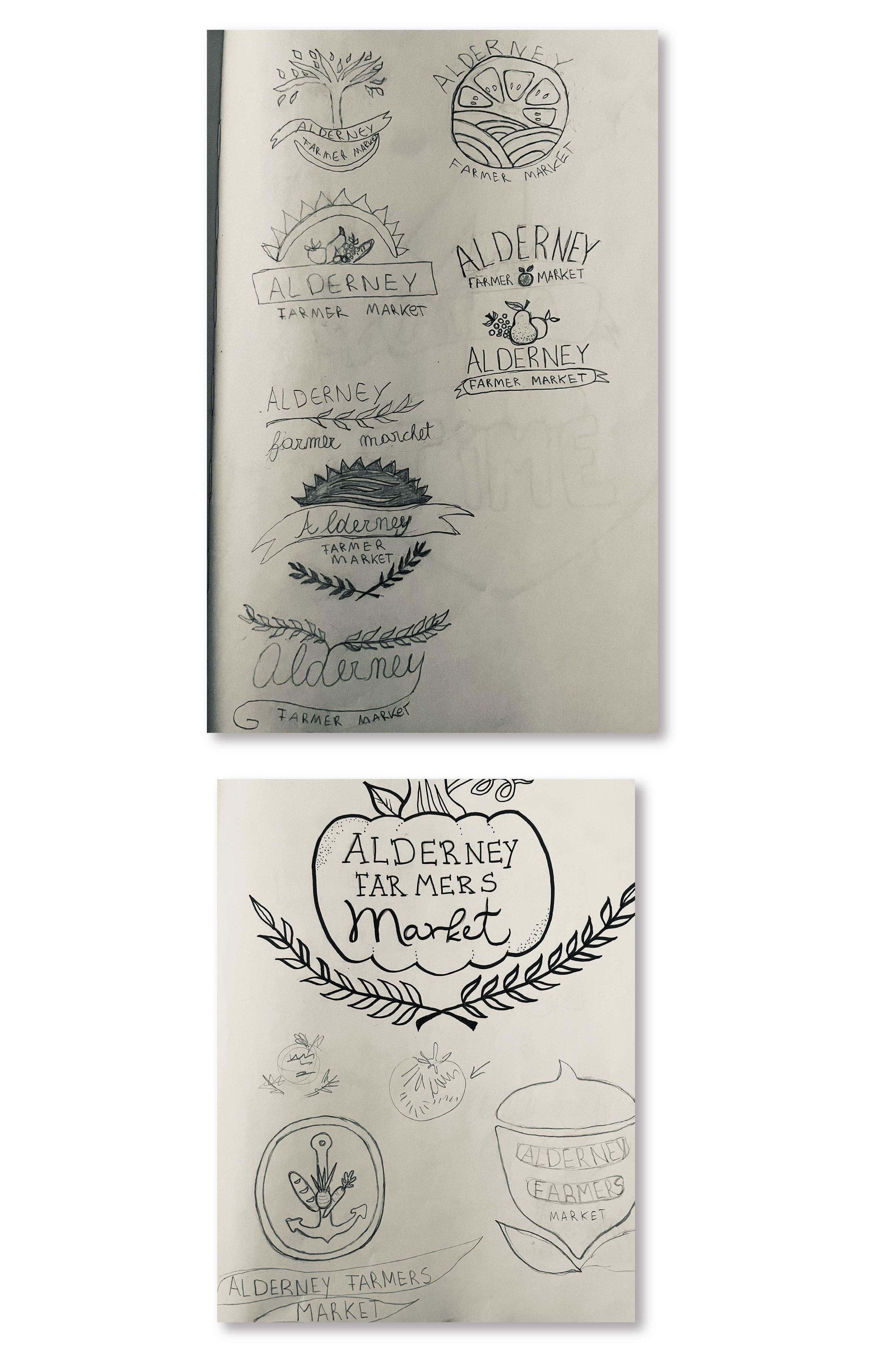
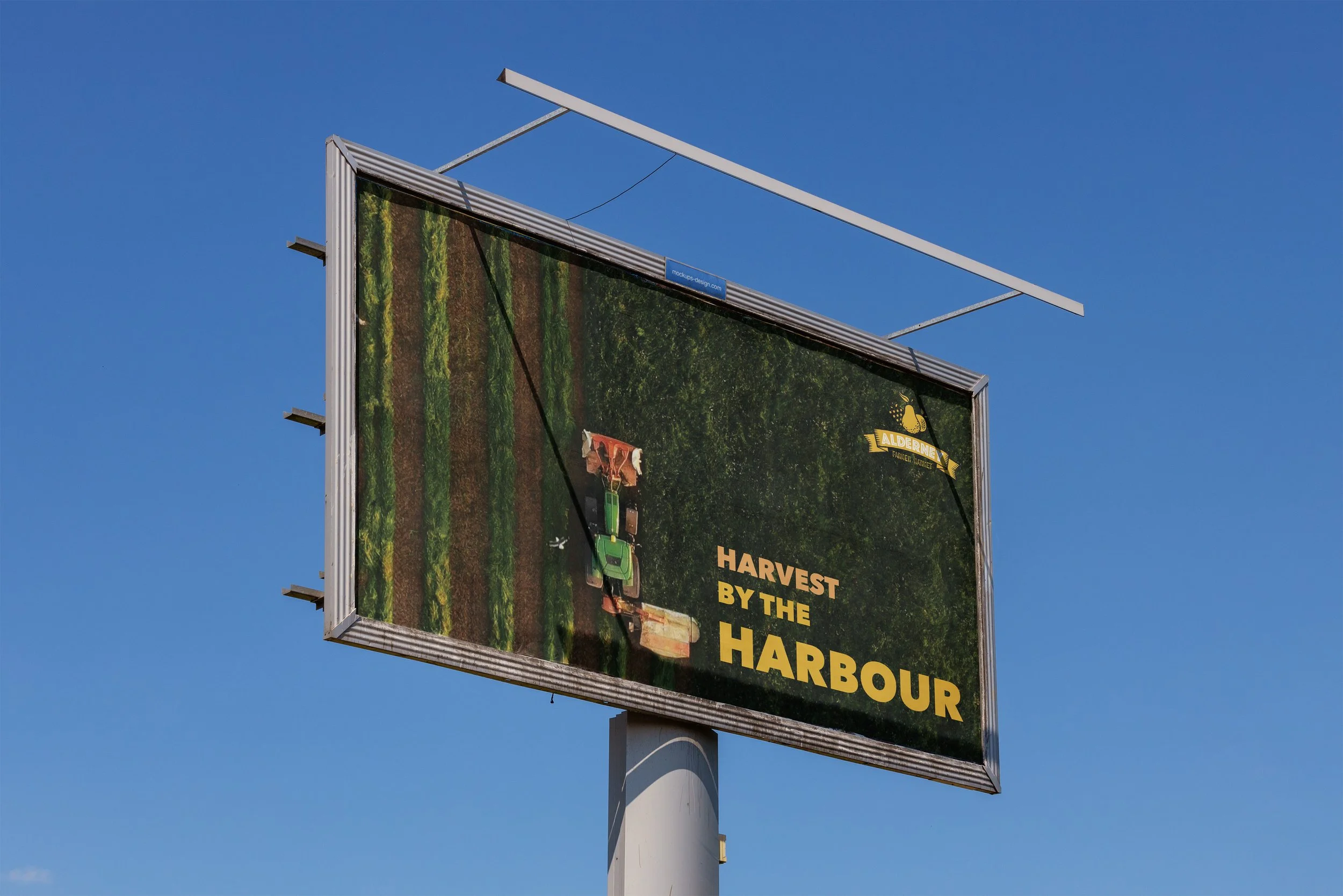
Brand revitalization focused on logo color exploration and a cohesive stationery system. The logo highlights farm products as the central element, paired with a rustic typeface that preserves the market’s traditional character while appealing to a wider audience.
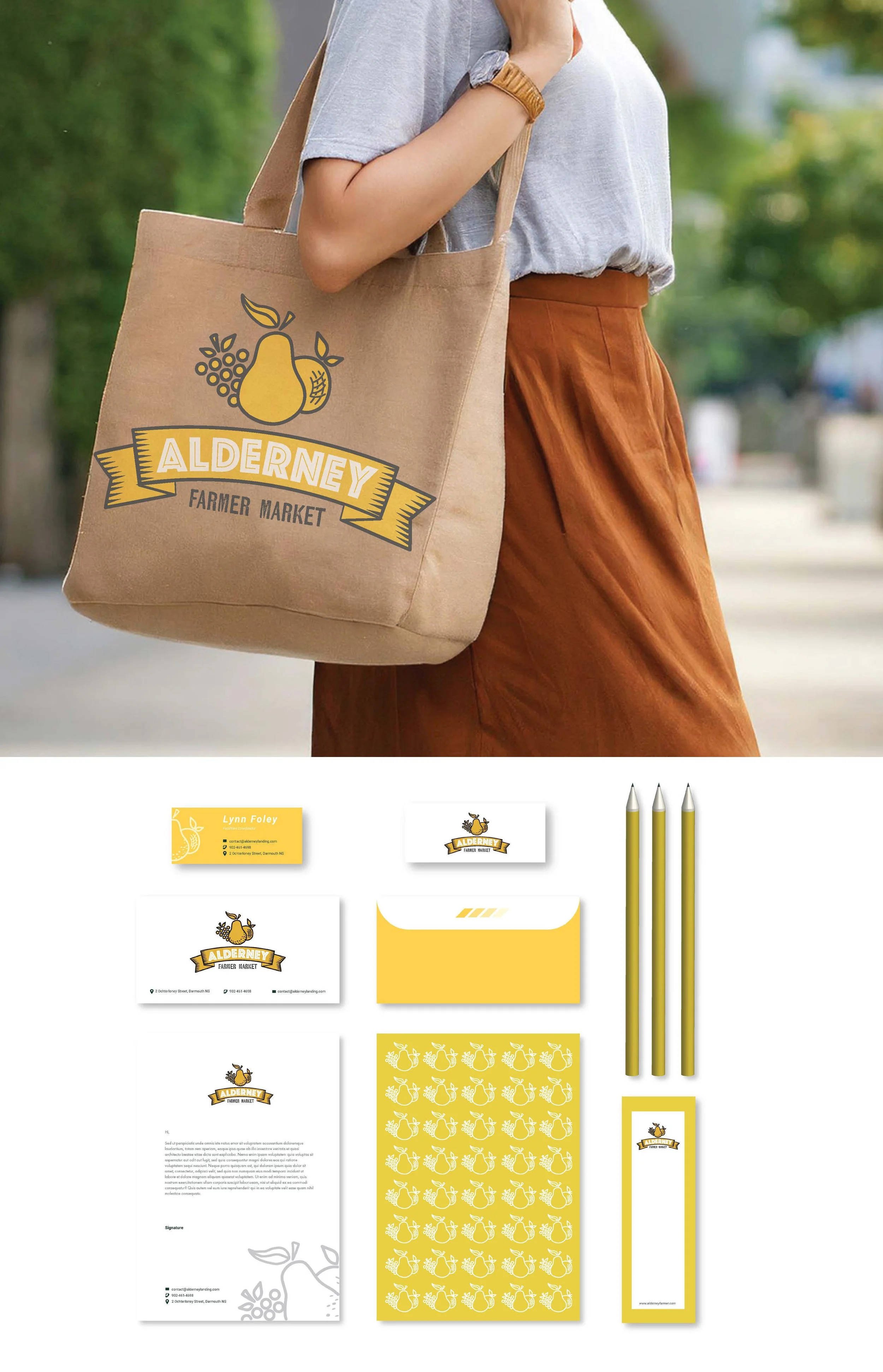
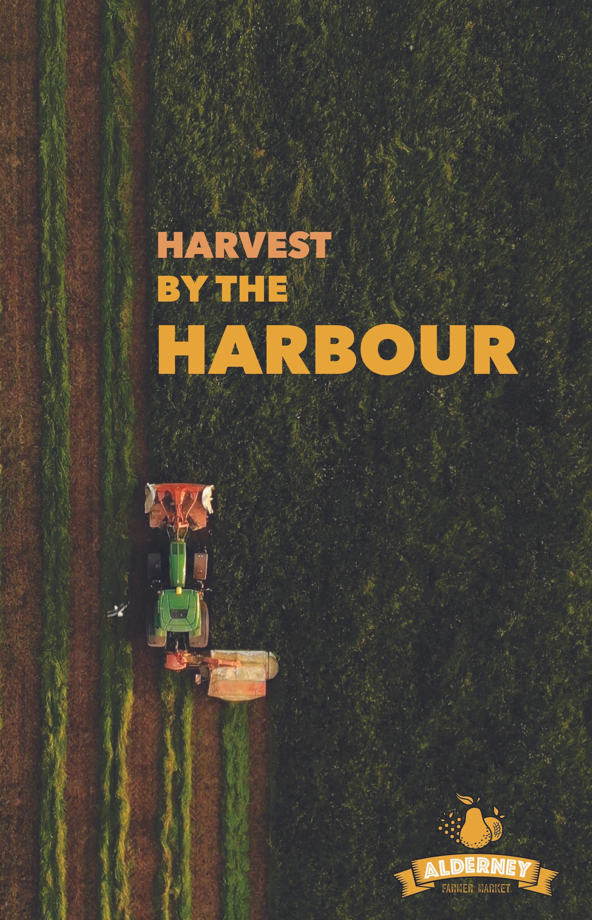
A warm earth color palette extends across business cards, a reusable market bag mock-up, and a promotional poster celebrating local harvest and locally sourced products — reinforcing the market’s strong community values.