Nordic Sopa Branding
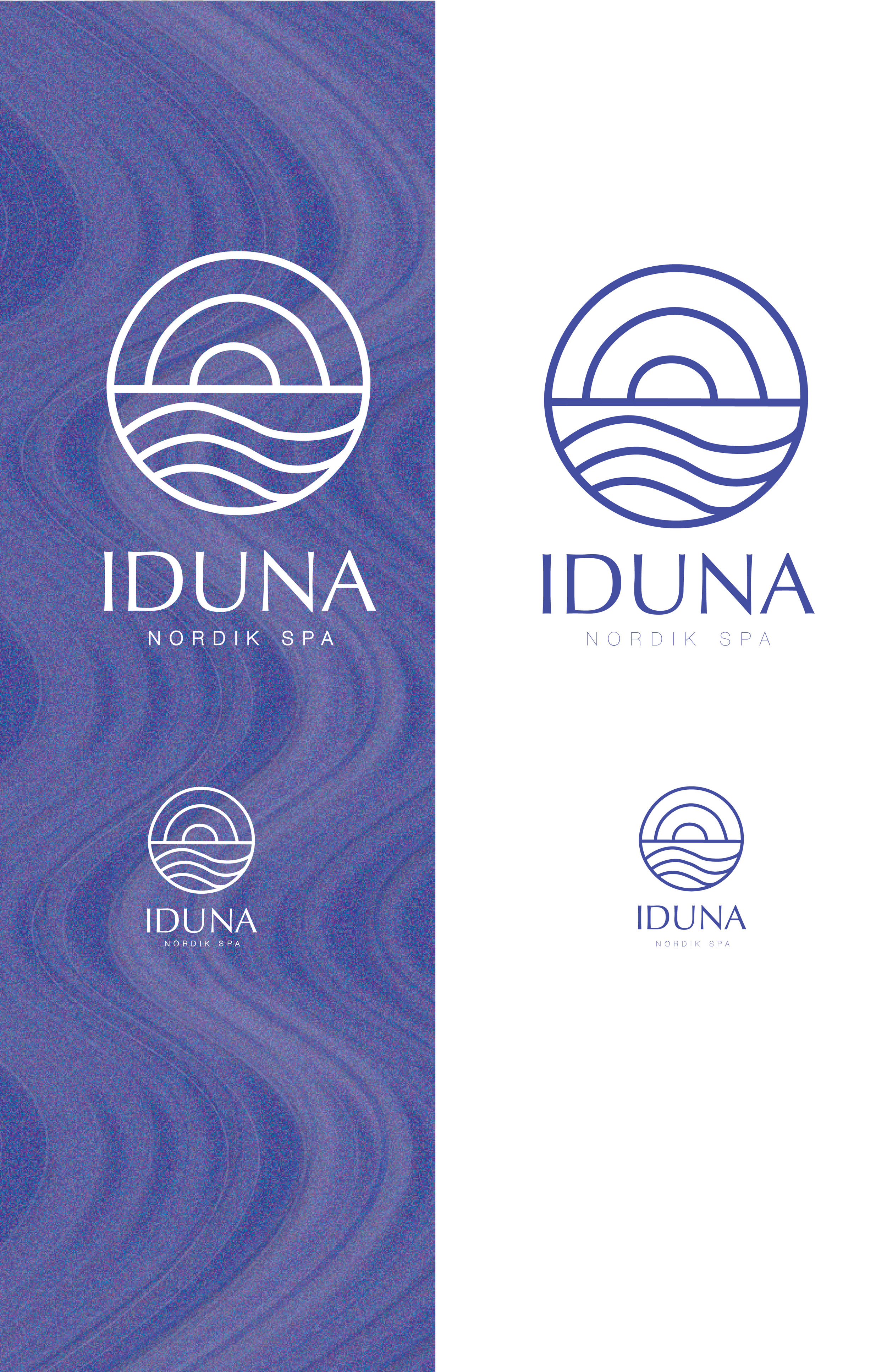
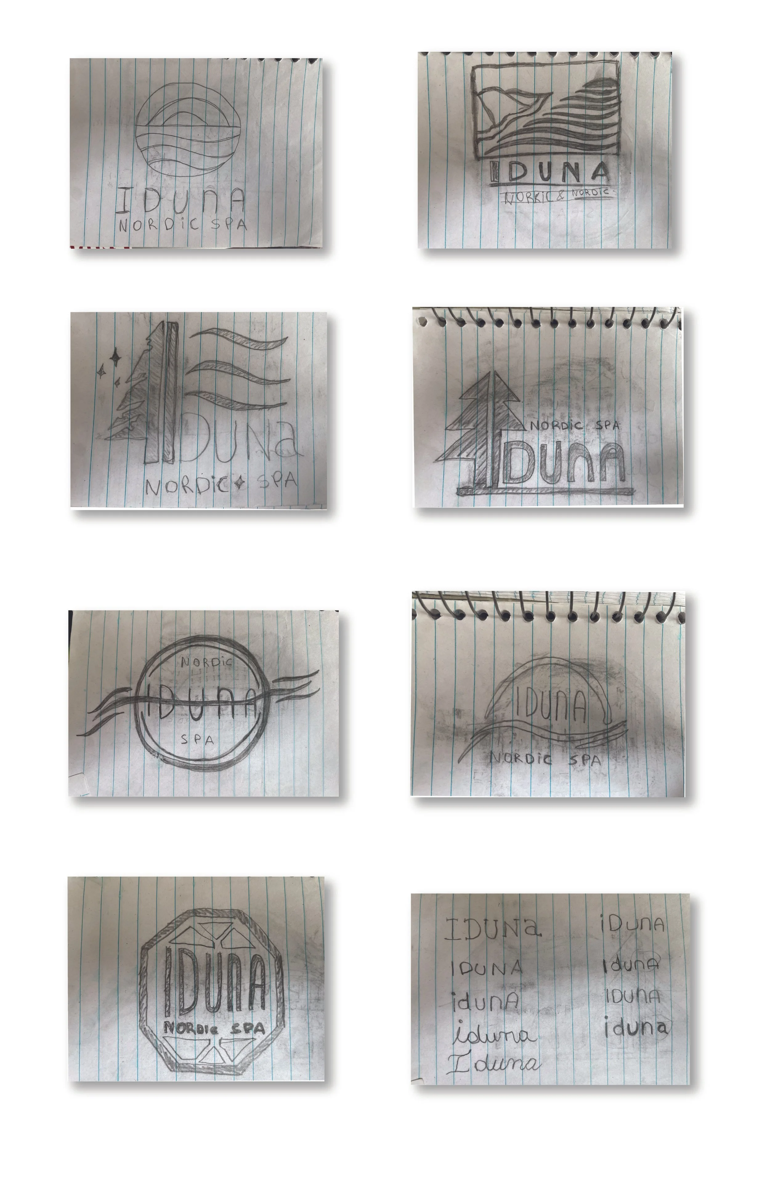
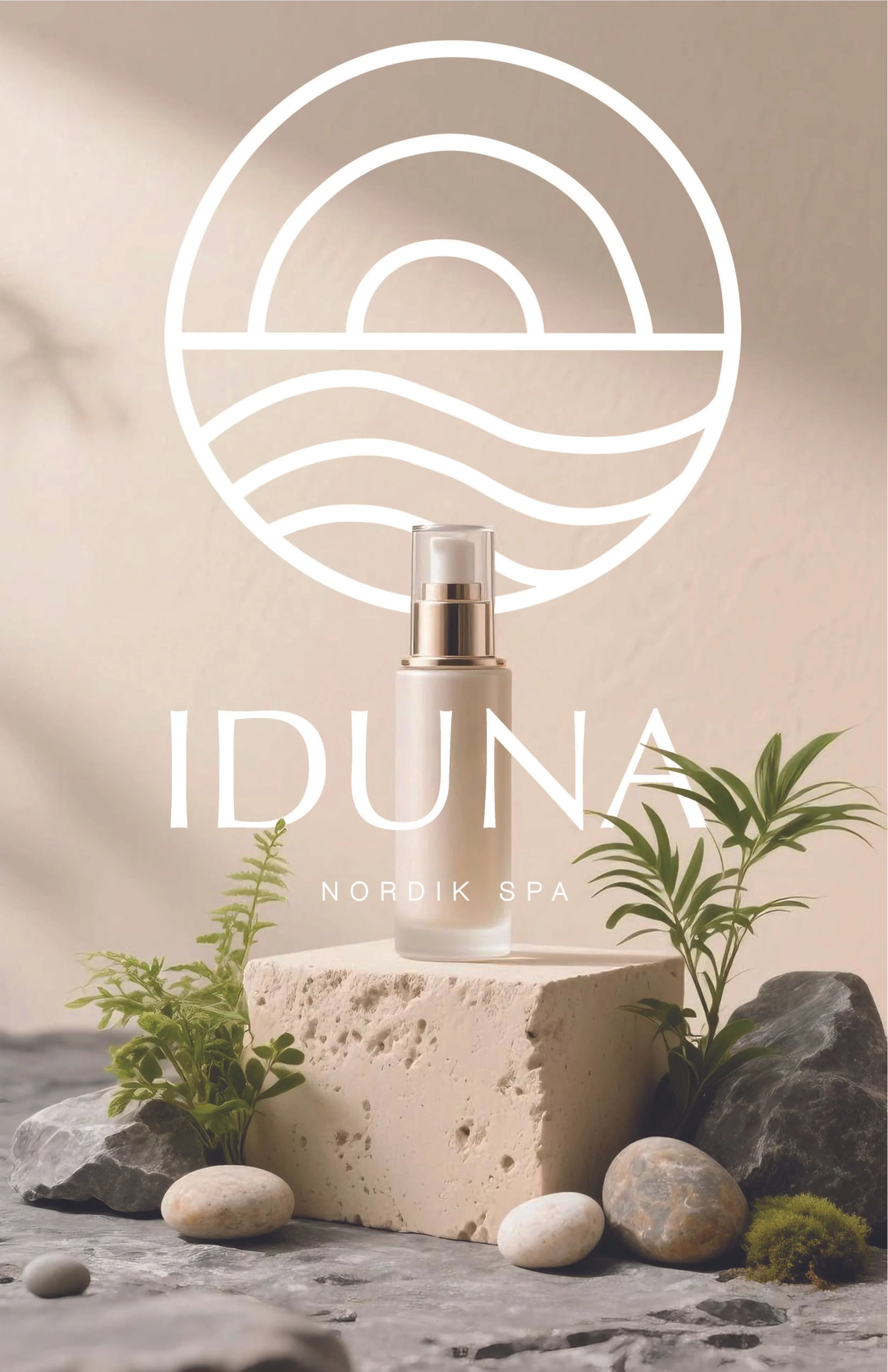
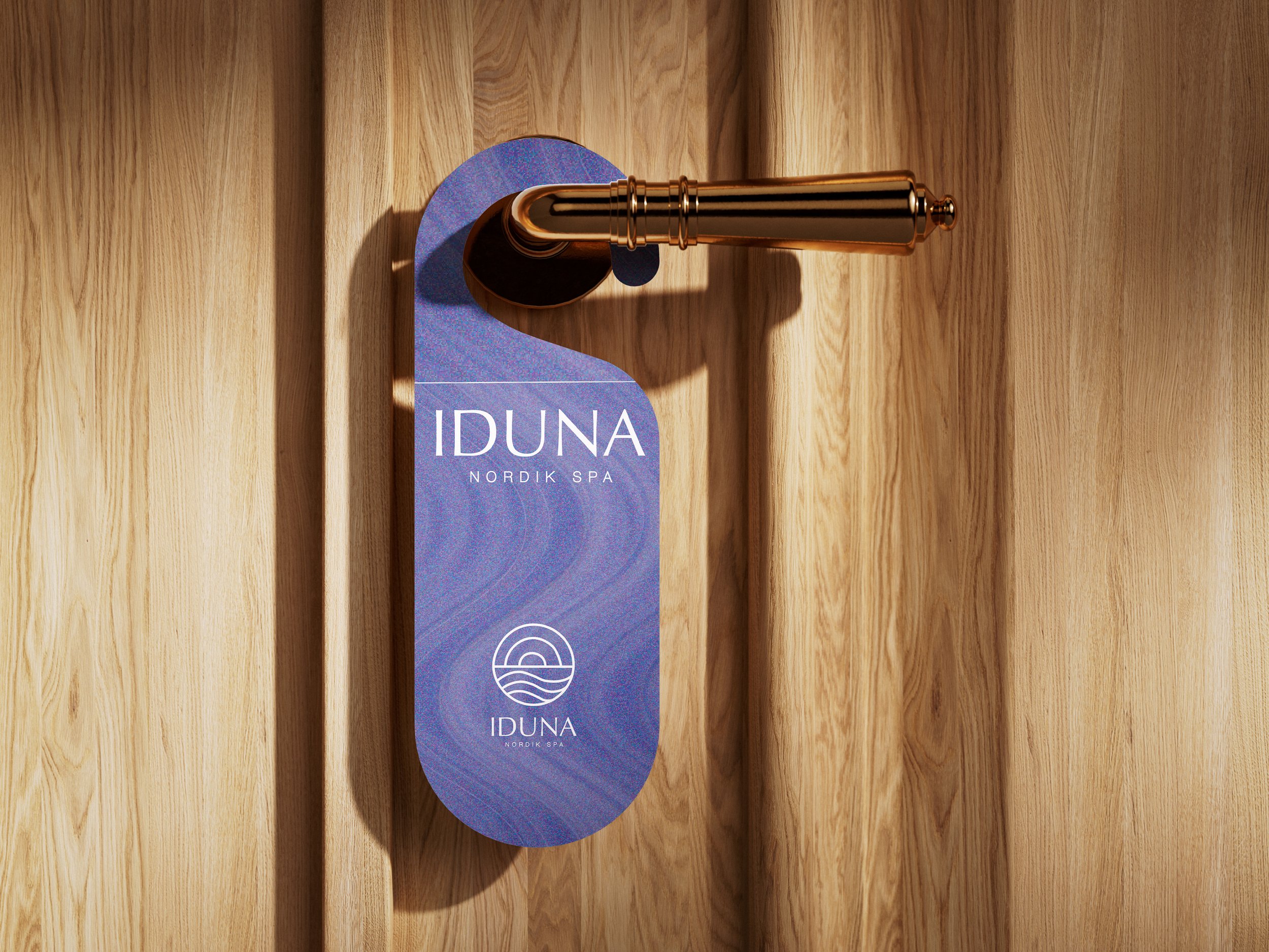
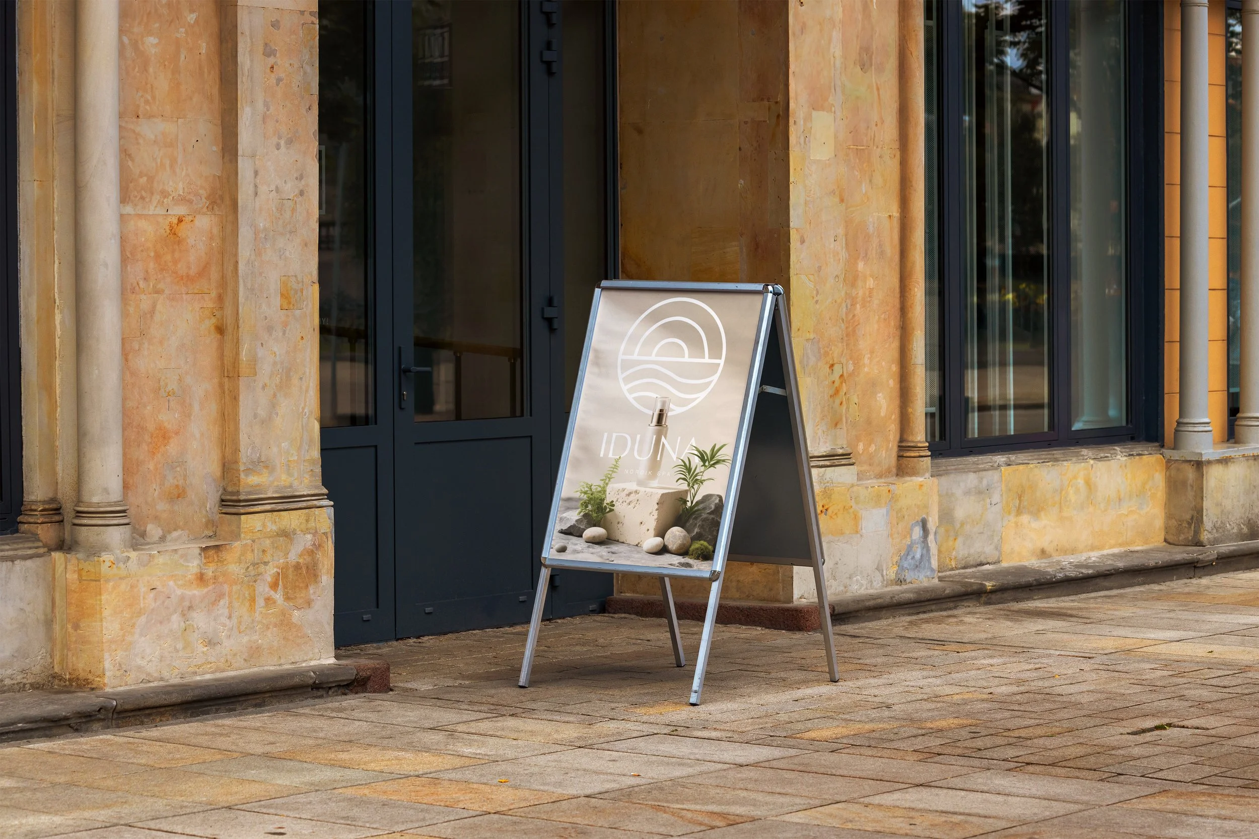
IDUNA
Fictional spa concept set in the Cape Breton Highlands, inspired by the purity and movement of its natural surroundings. The logo emerges from a fluid wave form, referencing the Atlantic coastline and the organic rhythm of the landscape. Blue functions as the core visual language of the brand evoking calm, depth, and renewal balanced with white to express clarity and simplicity.
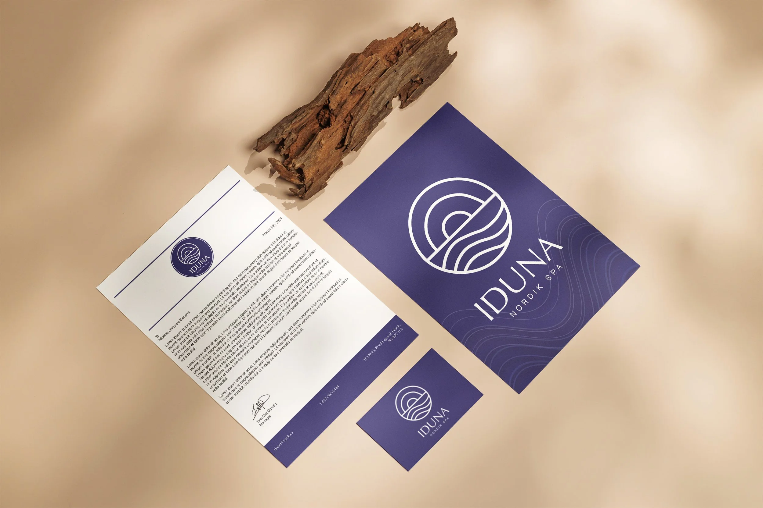
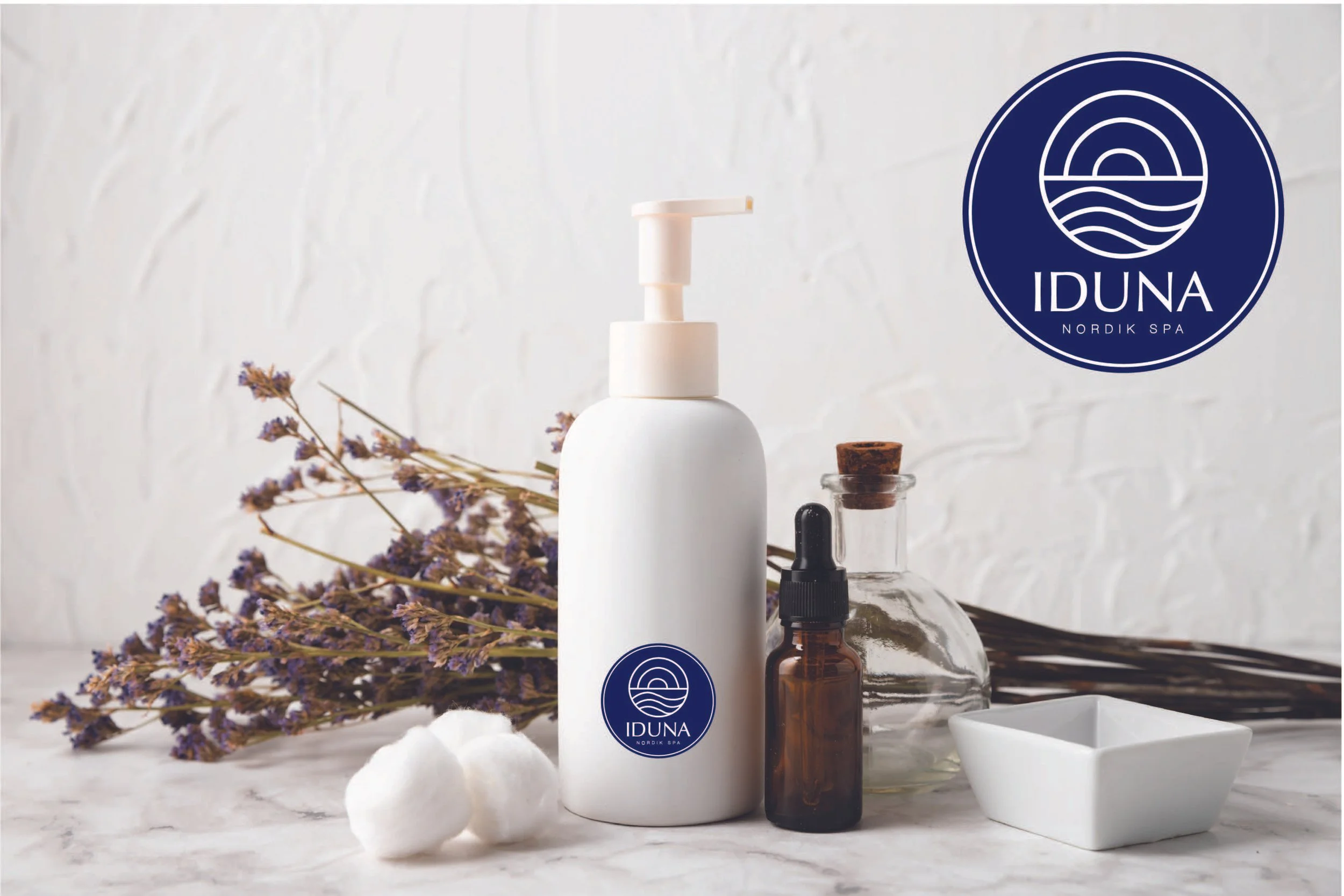
The identity extends across stationery and promotional pieces, including product advertising and posters, creating a cohesive and immersive brand presence.